It’s actually getting quite confusing now. Which email service should you use? Gmail? Yahoo? Hotmail? If you answered with Hotmail, look again (at your inbox, that is). It probably says “Outlook”. And no, you haven’t ended up with a paid service. It’s just a refreshed Hotmail version.
To be fair to Microsoft, calling Outlook.com refreshed isreally selling them short. They’ve done a stellar job of actually making anon-Gmail service look and work well. Admittedly, it’s just been a few dayssince they opened their doors to the world, but it’s a huge (humongous, really)improvement over what Hotmail had become. Bloated, unusable and quite frankly,pointless. So what makes Outlook.com worthwhile?
For one, Outlook.com does really extend the main features ofthe desktop mail client to the web. And it does without compromising too much onspeed or quality. The continued extension of the Metro UI is also a goodchange. It will let users get used to the interface before Windows 8 launcheslater this year.
Yes, there are some annoyances as you would expect. But thehope here is that Microsoft will listen to the users and iron these out. Theoperative word being hope! Without further blabbering, let’s dive right intoit.
As a webmail user, you’re now used to Gmail’s no-nonsenseinterface. They have added features over the years, but these have also madethe service seem complex. A simple 3-column layout here does the job. It alsomeans that you won’t be moving in and out of the inbox too often to read a mail.Similar to Outlook, this service shows your folders on the left, list of emailsin the middle and the mail on the right. And you can adjust the widths of thecolumns so you get the maximum for reading the actual email. Like with thedesktop version, you can also choose to have the ‘Preview Pane’ below the listof emails.
For those who want to further personalize this, it ispossible to change the colour of the top banner. The rest of it remains apleasing, somber grey which allows you to focus on the mail in front of you andnot get distracted.
The top left area that houses the logo will become activewhen you hover over it and let you switch to the People, Calendar and SkyDriveservices. All great ones to use as well.
It sends and receives mail. And lets you collect mail fromother accounts. And integrates Facebook, chat and lets you filter emails, applyrules and customize your signature… (deep breath) and does auto-sorting basedon the content in an email (photos, documents, flagged, etc.)… and so on!
Honestly, most other services will also let you do all this.What makes Outlook.com a winner is the ease with which these functions areachieved. After using Gmail for over half a decade, the author was so takenwith Outlook.com that he is now collecting all his mail from Gmail inOutlook.com. Score 1 for Microsoft!
The list of features isn’t mindboggling. It isn’trevolutionary. What is revolutionary is the ease with which everyday tasks areaccomplished. And for some reason, it is easier to keep this mailbox organizedand clean.
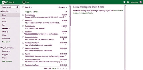
Small touches like not showing the first email right whenyou log in does make you feel secure. It’s to protect your privacy and thattoo, without some convoluted steps.
The mailbox wars are back! Hotmail lost to Yahoo, who inturn lost to Gmail and now Hotmail is back a la the Transformers! In a newer,stronger and meaner avatar. Can they build on this and make it a must-useservice? It would seem so…
