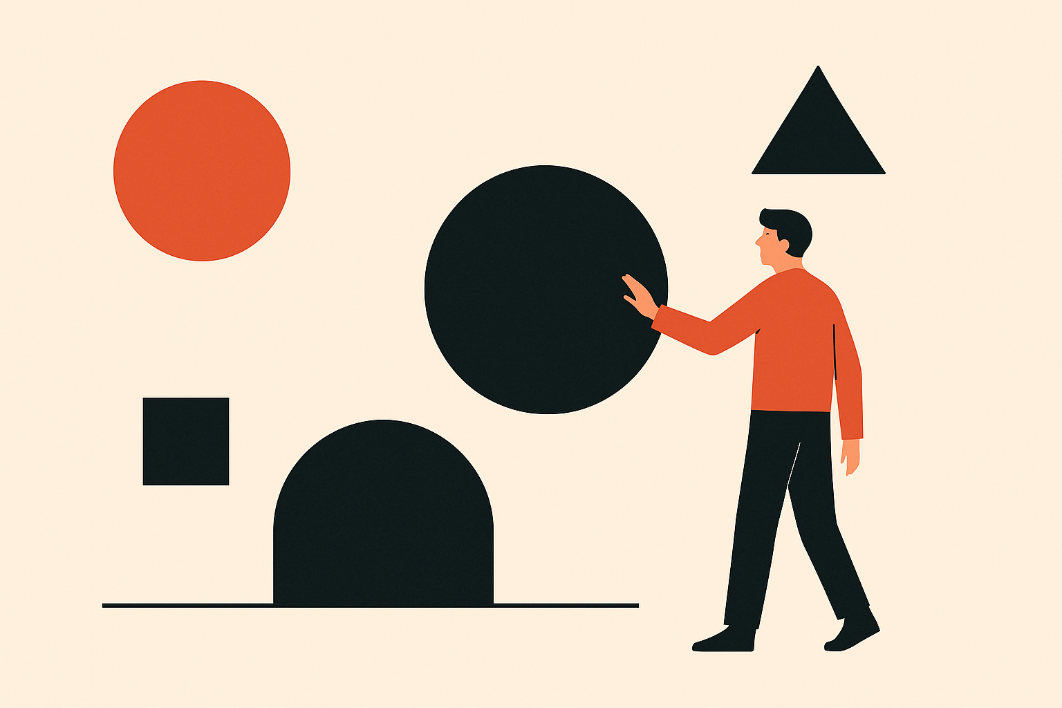
In an era where attention spans are shrinking and digital noise is skyrocketing, design has become a brand’s most decisive form of communication. Users no longer wade through long pages or cluttered interfaces—they judge intuitively and almost instantly. That’s where minimalism emerges not as an aesthetic choice, but as a strategic advantage. Connecting the dots through intentional simplicity is how brands craft clarity, trust, and emotional resonance in seconds.
Minimalism isn’t about less for the sake of less. It’s about making every element earn its place. A single commanding headline, a crisp call-to-action button, a well-chosen image—when arranged deliberately, these components become powerful signals that guide, reassure, and persuade. The goal is not to impress with complexity, but to communicate with precision.
Design schools have long taught that the most impactful interfaces aren’t the ones overflowing with features, but those built upon a foundation of human psychology and visual logic. This begins with the Gestalt principles, which explain how our brains naturally organise information. We instinctively group elements that are close together, similar in shape, or aligned in direction. Good spacing can create hierarchy and flow without the user consciously noticing it. When spacing is intentional, the eye moves effortlessly; when it isn’t, users feel lost before they even know why.
Another cornerstone is Fitts’s Law, a deceptively simple rule that governs how easily we interact with digital elements. It states that larger and closer targets are easier—and faster—to click. This is why oversized buttons, floating action elements, or accessible navigation structures outperform tiny, buried links. Whether it’s a sign-up button, a support icon, or a purchase CTA, usability improves when the interface reduces effort. And in design, effort is friction.
Colour plays its own psychological role. Colour theory, taught as early as the foundation year in most design programmes, shows how hue, saturation, and contrast shape emotion and behaviour. Blue evokes trust and calm, which is why financial platforms and SaaS companies often adopt it. Red activates urgency and attention, making it ideal for alerts or promotional elements. Muted neutrals signal elegance and restraint, while high-contrast palettes provide energy and immediacy. The right colour system becomes a brand’s emotional shorthand—speaking before the words do.
Typography hierarchy is another non-negotiable. Fonts not only deliver information—they carry tone. A bold, oversized headline establishes direction and authority. Subheads break complexity into digestible pieces. Body text maintains rhythm and readability. When the hierarchy is well-designed, users instinctively know where to look next. When it isn’t, every line becomes a competition for attention. Good typography does what great storytellers do: it leads, nudges, and whispers in all the right places.
Then comes negative space, often misunderstood by beginners as emptiness. In truth, it’s breathing room—the visual pause that makes content feel refined. Luxury brands rely heavily on negative space because it signals confidence: We don’t need to overwhelm you; the essentials speak for themselves. In minimalistic design, empty spaces are active elements. They create balance, direct the gaze, and elevate the experience. Without them, even the best layout suffocates.
But principles alone don’t build great design. What unites them is a philosophy: user-centred design. This discipline demands testing, iteration, and the humility to simplify when needed. The best designers assume nothing. They observe how users actually behave, identify friction points, and refine until interaction feels natural. A layout that looks clean is one thing; a layout that feels intuitive is another. Great design achieves both.
Minimalism becomes powerful only when it is anchored in empathy—understanding that users seek clarity, not complexity. They want to know who you are, what you offer, and why it matters, all without cognitive strain. When the path is clear, trust forms faster. When trust forms, conversion follows. And once users feel understood, loyalty takes root.
Clean, intentional design does more than please the eye—it strengthens business outcomes. It reduces bounce rates by removing confusion. It increases engagement by making actions obvious. It boosts conversions by eliminating guesswork. And, importantly, it differentiates brands in markets where everyone is shouting but few are truly communicating.
Minimalism is not an aesthetic trend; it’s a strategic language. It’s your silent pitch, delivered with precision. It’s your brand speaking at its clearest, strongest volume—without ever raising its voice. In a world overloaded with choices, people gravitate towards what feels effortless.
When your design connects the dots for them—through hierarchy, space, motion, colour, and logic—you’re not just creating a visual identity. You’re creating a promise: we respect your time, we understand your needs, and we know exactly what we’re doing. And in the digital age, there is no message more powerful.